
Branding
sonset music
sonset music

When Miami-based indie artist Sonset was preparing to release his first EP in 2020, he needed more than just music. He needed a brand.
From brainstorming an artist name to designing album art and crafting a social media launch strategy, I helped shape his visual identity. Since then, he’s continued to rely on my photography, design, and marketing expertise to bring his music to life online.

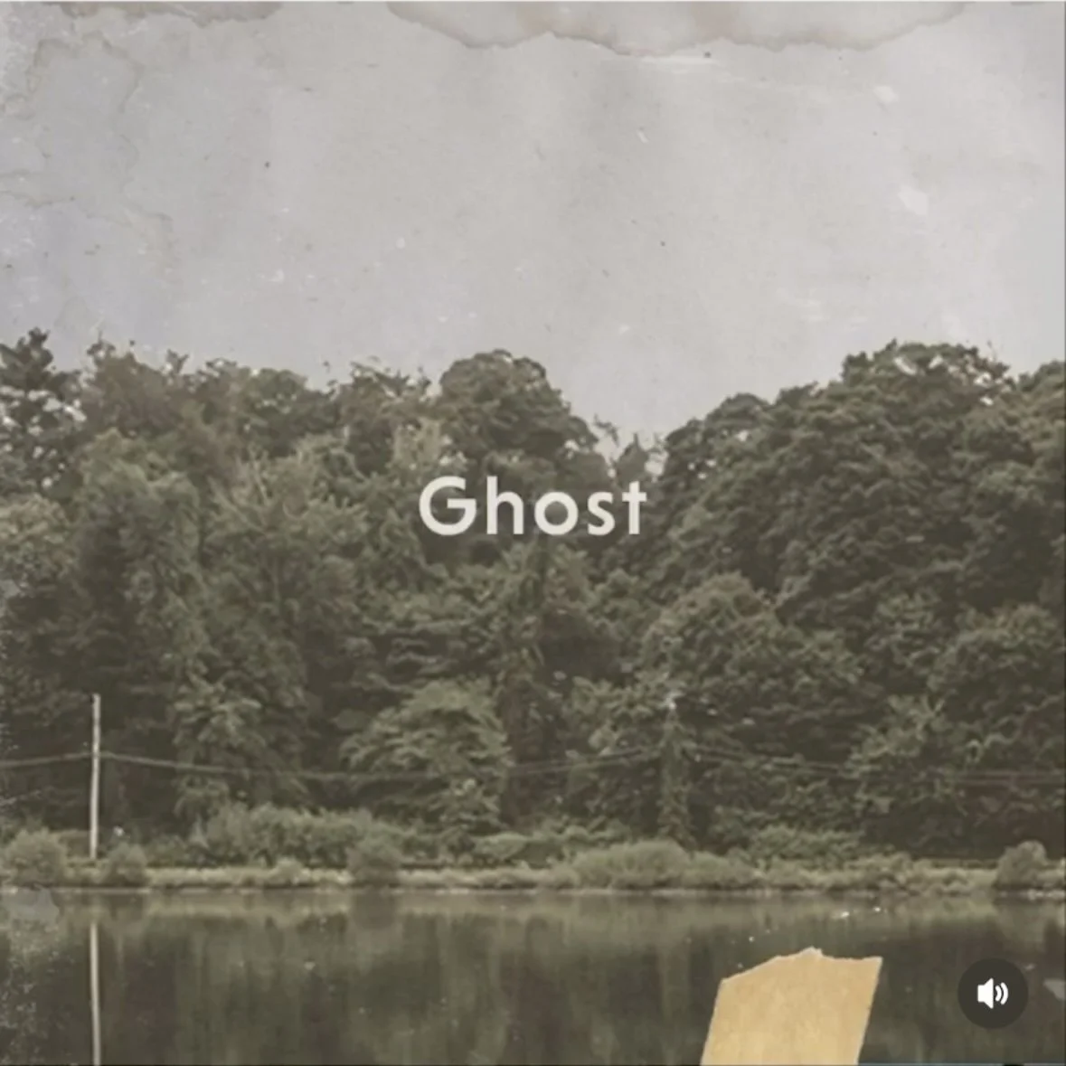
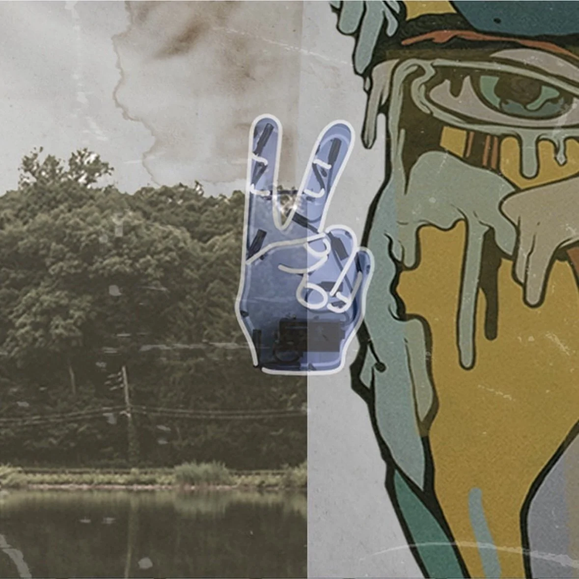
Sometimes, the best ideas come from the unexpected. The cartoon eyes were
a joke at first, but they stuck and soon became the defining look of Sonset’s debut EP.


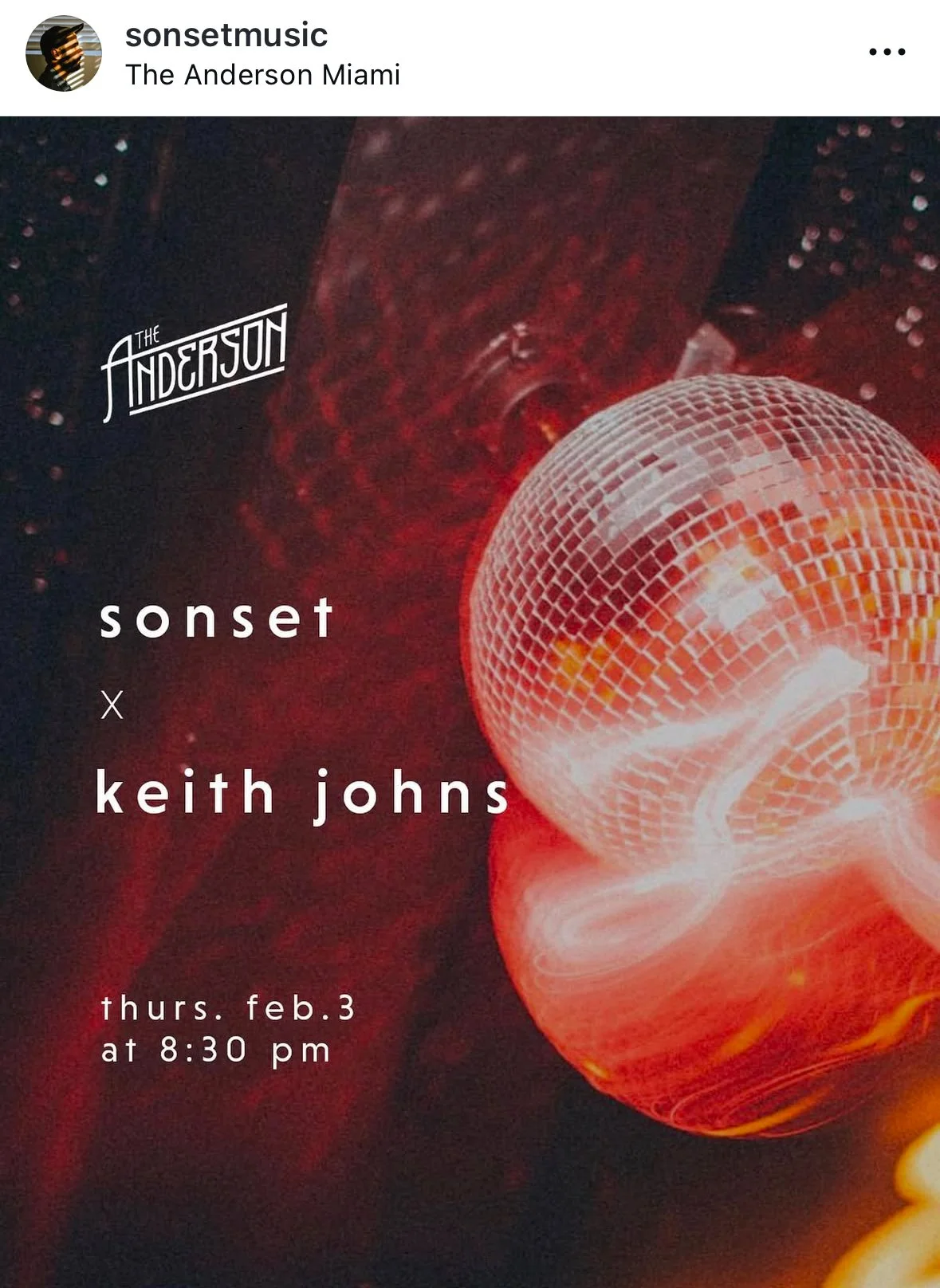
Before Sonset’s music hit streaming platforms, his brand took shape on Instagram. This six-post series teased his sound, built suspense, and created a visually striking first impression.


With Spotify’s Canvas feature, So Long used a looping video to enhance the track’s vibe.
Additionally, social media helped spread the word about a local show.
Study Florida
Study Florida

When I joined Study Florida’s board, the organization was ready for a fresh start. I led a full rebrand that included a new logo, updated website, and cohesive design system across digital and print materials. Alongside managing social media, web, and graphic design, I helped elevate the organization’s visibility, and in just one year, membership grew from 28 to 37 institutions.
Out with the old, in with the new


The old logo lacked versatility and felt dated. It didn’t translate well to black and white, making it difficult to adapt across platforms and materials.


After multiple rounds of feedback and revisions, the new logo was approved by the full consortium. It introduced vibrant colors and flexible layouts, finally giving Study Florida a visual identity that works across formats.


The updated logo and visual identity were applied across all materials, including business cards, promo items, brochures, and the newly overhauled website. Every piece was redesigned to reflect the new look and create a consistent, professional brand presence.


To also created custom gradients using the Study Florida brand colors. These were used across social media graphics and print collateral to bring energy and depth to the overall design.
Career Week
Career Week


When I pitched the idea of hosting an influencer panel, I had no idea it would spark a major change and transform the University of Miami School of Communication’s typical 1-day Career Fair into the first-ever Career Week.
With a brand-new event came the need for a brand-new visual identity. One that was professional yet engaging, versatile enough for multiple events, and adaptable for years to come.


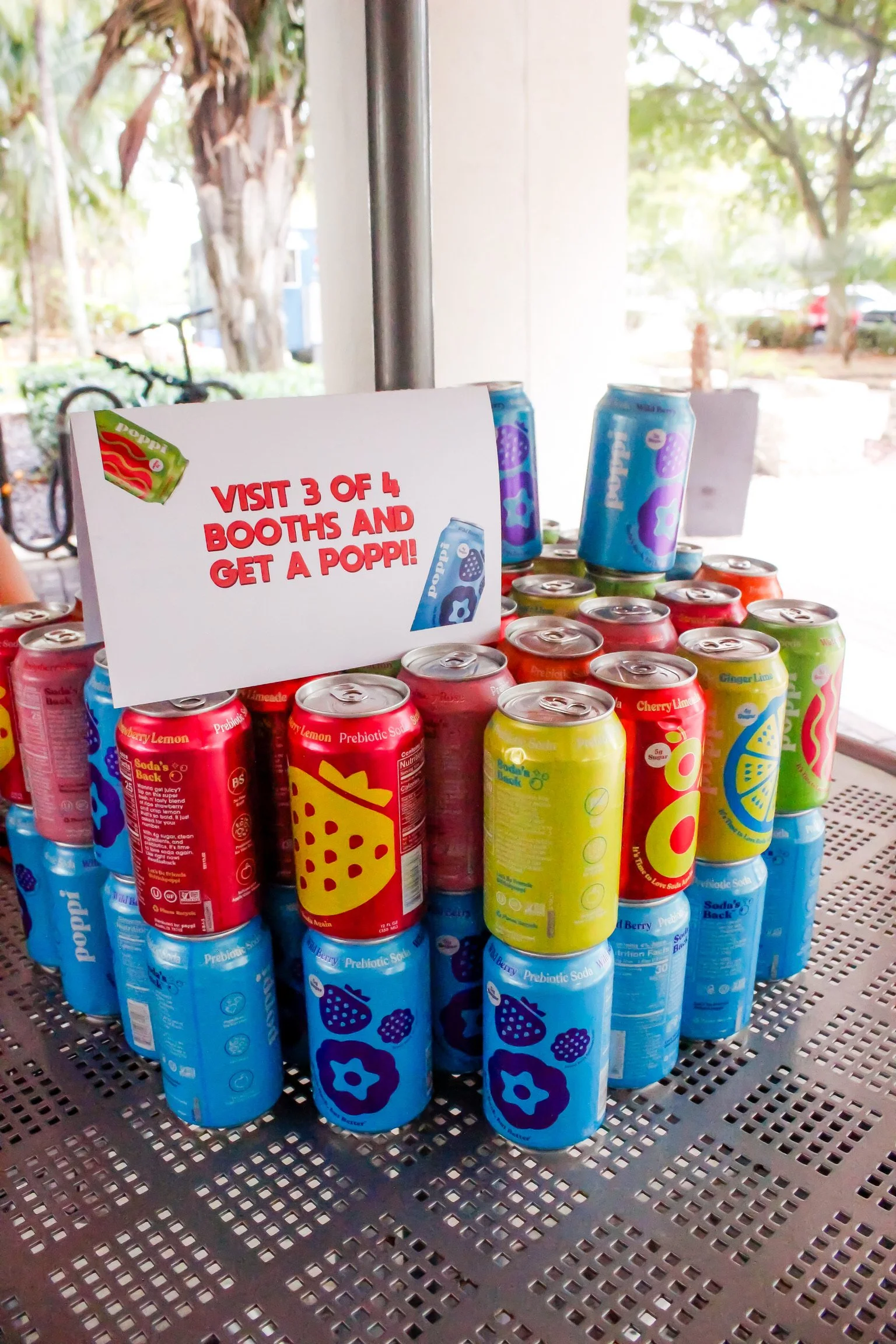

From flyers and posters to banners and signage, I made sure Career Week’s branding couldn’t be ignored. Ditching the traditional UM color scheme, I took inspiration from Poppi, a soda healthy brand that generously donated hundreds of drinks for the event. The result? A fresh, energetic design that stood out on campus and carried seamlessly into the event’s website.